
Components
Flux provides a wide range of pre-built components that serve various purposes in web development. These components are designed to be consistent and reusable, helping developers efficiently build and customize user interfaces. From basic elements like buttons and input fields to more complex structures like modals and data tables, Flux's component library covers many common needs in application development.
The components are grouped by what you reach for them to do, from everyday buttons and forms up to complete data displays, with the low-level primitives and utilities gathered near the end. Use the categories below to find your way around.
Buttons & actions
Buttons and clickable triggers that let people perform an action.
 Action
 Action barAction paneButton / DestructiveButton / GroupButton / PrimaryButton / Primary LinkButton / PublishButton / SecondaryButton / Secondary LinkButton / SplitChipToolbar / Group
Indicators
Badges, tags and loading states that communicate status at a glance.
Forms & input
Everything you need to capture and edit user input, from single fields to complete forms.
Checkbox / GroupCheckbox / TileColor / PickerColor / SelectColumnComboboxDateDate pickerDate rangeDate timeDrop zoneFader / RangedField / AdditionGridInline editInput / AdditionInput / GroupNumber inputPIN inputQuantity selectorRadio / GroupRadio / TileRatingRowSectionSelect / AsyncSlider / RangedStepTags inputText areaTimeTime zone pickerToggleTree view selectNavigation
Wayfinding and view-switching, so people can move around and change what they see.
Breadcrumb / FlyoutBreadcrumb / ItemCommand paletteContext menuExpandable / GroupMenu / CollapsibleMenu / FlyoutMenu / GroupMenu / ItemMenu / OptionsMenu / PaneMenu / Sub headerMenu / TitlePagination / BarSegmented control / Item StepperStepper / StepStepper / StepsTab bar / ItemTabs / Tab
Data display
Tables, lists and other structured ways to present data.
Calendar / Item CommentData tableDescription list / ItemFilter / Async optionFilter / Async optionsFilter / BarFilter / DateFilter / Date rangeFilter / OptionFilter / OptionsFilter / RangeKanban / ColumnKanban / ItemTable / ActionsTable / BarTable / CellTable / GroupTable / HeaderTable / RowTable / Tree cellTicksTimeline / ItemTree view
Media & people
Avatars, personas and media so faces and imagery feel at home.
 Avatar
Layout
Structure and align content into responsive, consistent layouts.
Adaptive groupAdaptive slot Aspect ratio
 ContainerDividerFader / ItemFlex / Item
 GridGrid / ColumnItem / ActionsItem / ContentItem / MediaItem / StackOverflow barSeparator
 Spacer
 SpacingSplit view / PaneStack / ActionStack / BadgeStack / ButtonStack / InfoStack / NoticeStack / Tag
Overlays & surfaces
Panels, overlays and floating surfaces that layer content above the page.
FlyoutOverlayPane / BodyPane / ClickablePane / Clickable headerPane / FooterPane / GroupPane / HeaderPane / Layer panePane / MediaSlide overWindowFeedback
Alerts, notices, snackbars and tooltips that keep people informed about what is happening.
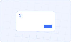 Alert
Alert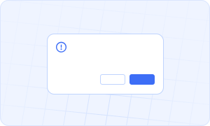 Confirm
 Notice
 Prompt
 Snackbar
Primitives
The low-level building blocks and app-level primitives that everything else builds on.
 Boxed icon
 Icon
Icon Link
LinkUtilities
Behavioural helpers with no visual output of their own, from sharing a disabled state to rendering a dynamic view.
Transitions
Ready-made transition components for animating content in and out.